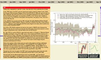
 The scandal that has rocked climate change science encompasses a 30 year time span and dozens of the world’s top climate scientists. A thorough analysis of all of the Climategate emails entailed an extraordinary amount of work to correlate the emails with the events that were happening at the time – until now. A new chart puts the entire event and the last 30 years of applicable climate science in an easy to use format. Created by Mohib Ebrahim, the new graphical timeline provides a complete picture of the events in the emails in an easy to read and use format. “ClimateGate: 30 years in the making” digests all of the pertinent emails, documents, historical events and graphs down to one large chart that can be viewed on screen or printed. The chart is hosted on the Australian website JoNova and will be updated regularly as new information is discovered and analyzed. It is an important document for anyone interested in the scandal and all of the events leading up to it. Follow the link below to download the chart.
- ClimateGate: 30 years in the making – Download chart in various formats
- Complete Climategate coverage from the Climate Change Examiner
Source by Tony Hake